Your Neighborhood Sub Shop
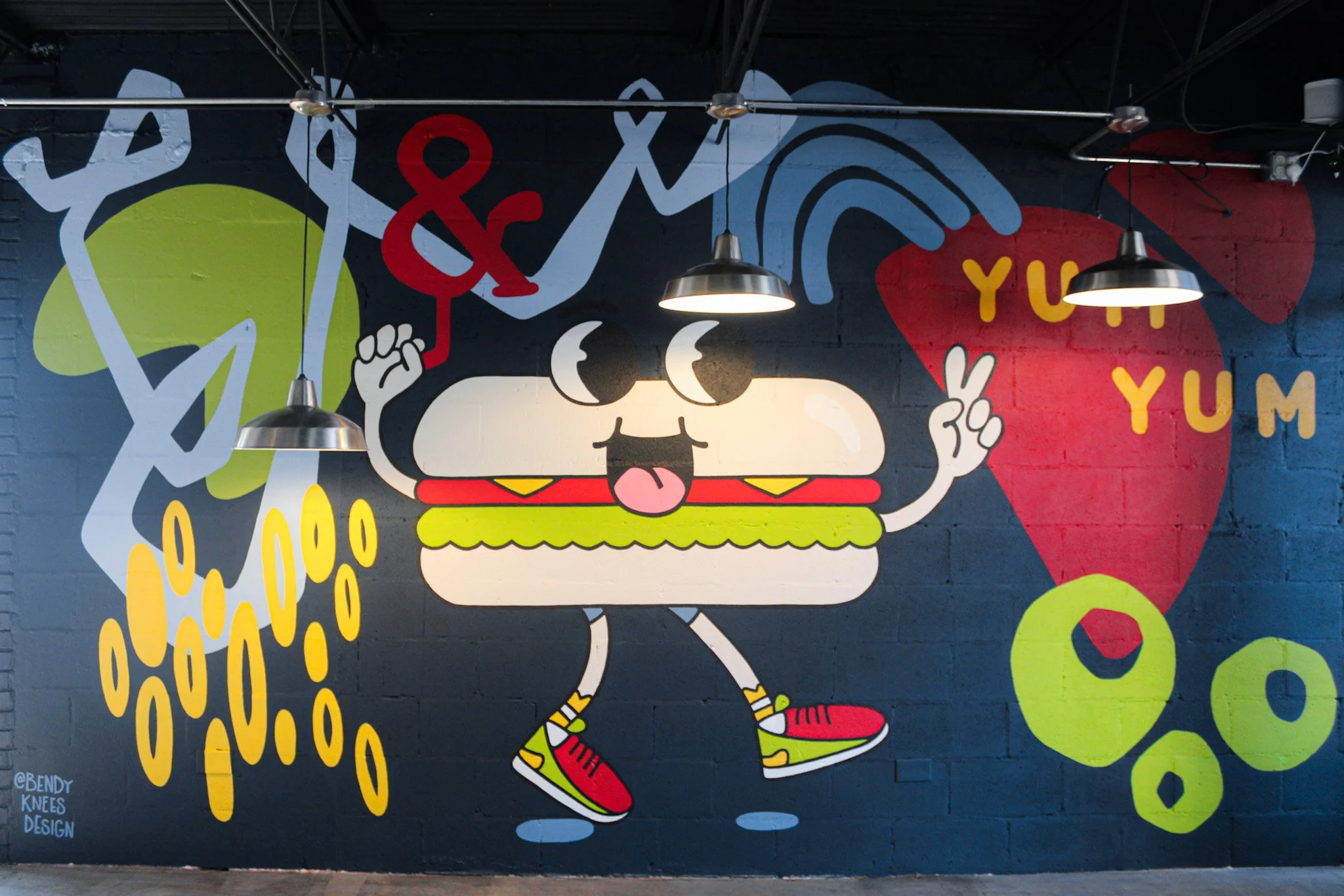
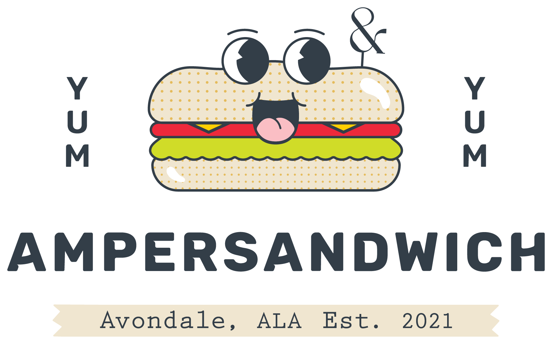
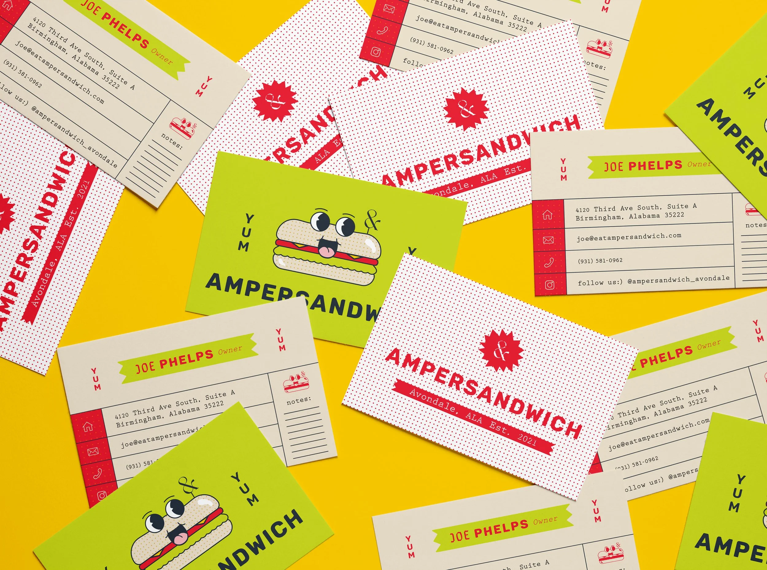
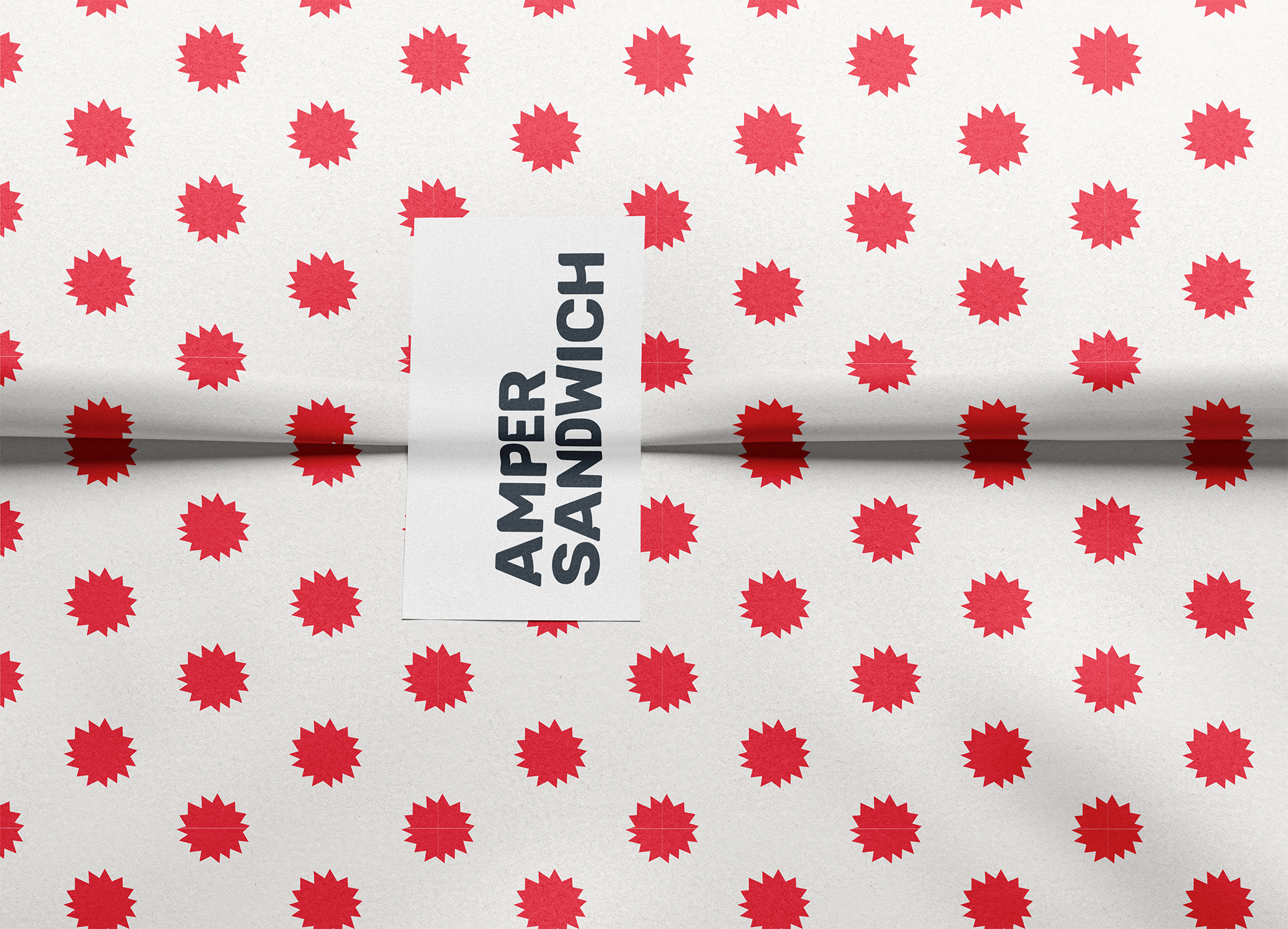
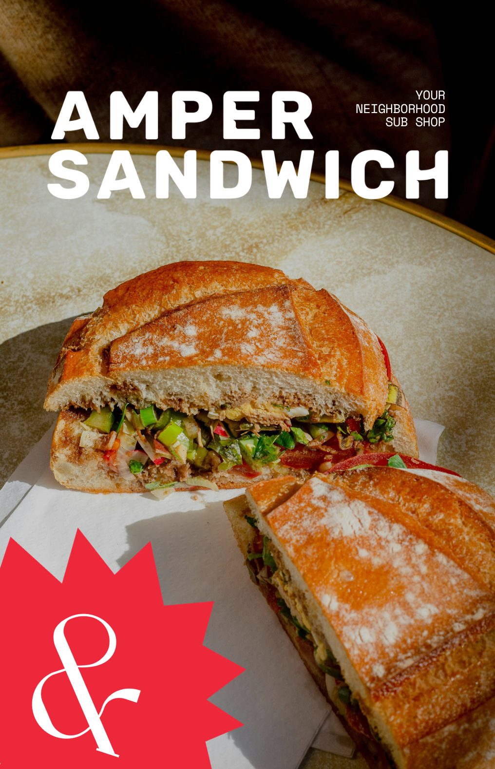
For Ampersandwich, I developed a brand identity rooted in nostalgia, approachability, and local character. Inspired by vintage print, newspapers, and hand-drawn elements, the visual system balances playful personality with a sense of familiarity, positioning the restaurant as a welcoming neighborhood staple. The identity centers around the ampersand as a core brand device, paired with a simplified sandwich icon to create a mark that is both clever and immediately recognizable. From there, I built a cohesive brand system and guidelines to ensure consistency across all touch points, from logo usage to typography and supporting graphics.
Roles and Responsibilities
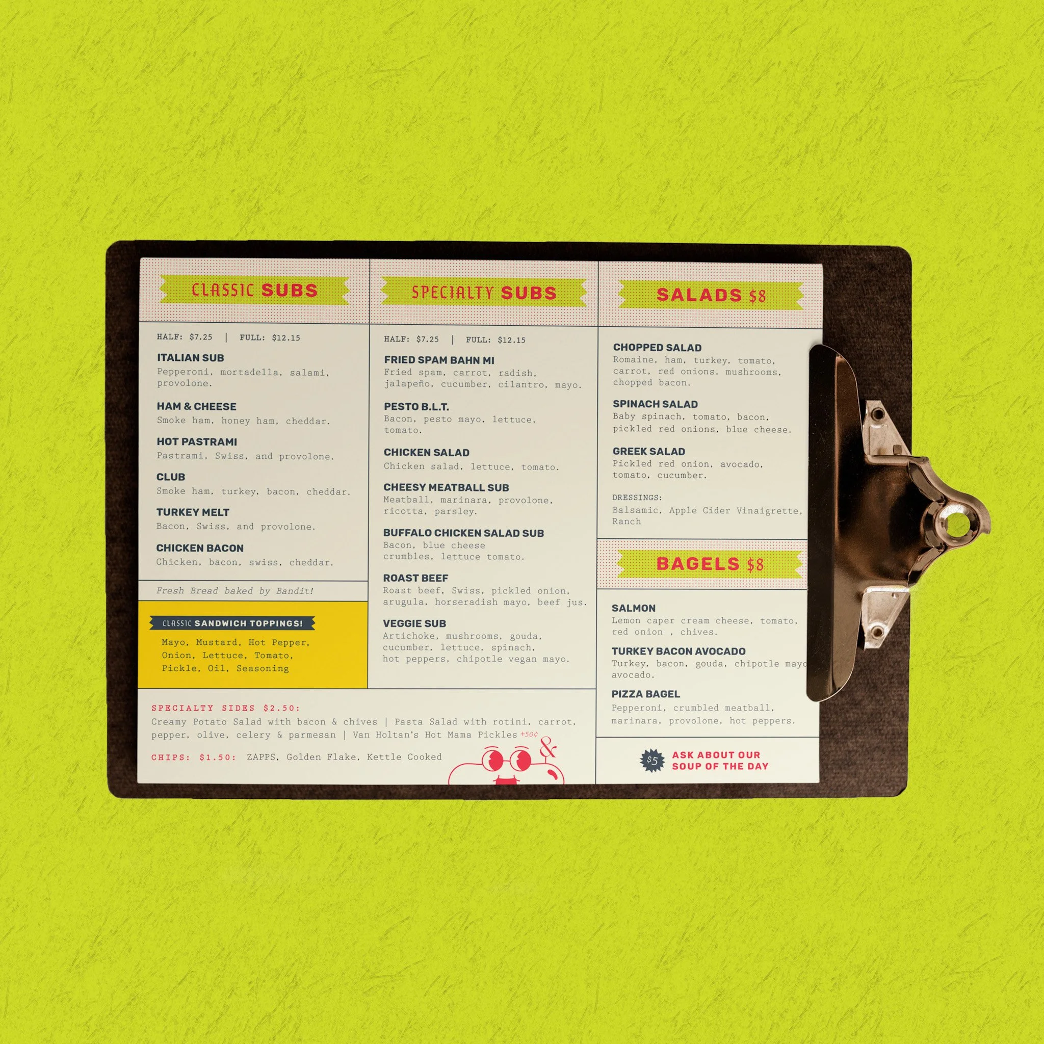
As the lead designer on this project, I oversaw the full visual direction from concept to execution. I worked closely with the client to translate their vision into a distinct and functional brand, leading brainstorming sessions, sketching initial concepts, and refining the identity through iterative design. I was responsible for all visual design deliverables, including menu design and supporting brand assets, ensuring each piece aligned with the overall system while remaining practical for real-world use.




• TOASTED
PRIMARY
• STEEL
PRIMARY
• SAY CHEESE
ACCENT
• TOMATO
ACCENT
• RELISH
ACCENT