Personalized physical wellness and quality care
At the heart of NOVA is the belief that everyone’s path to recovery is unique and should be treated as such. They encourage quick recovery through a holistic, sustainable experience grounded in personalized attention to your needs. My goal was to create a brand identity that reflected these values. One that felt approachable, trustworthy, and rooted in the idea of whole-person care.
Roles and Responsibilities
I partnered closely with the founder to uncover the story behind the practice and the values that would shape its identity. During our discovery process, I learned that the name NOVA was inspired by her hometown of Nova Scotia and her journey to Birmingham. That sense of connection, community, and belonging became a guiding principle throughout the design process.
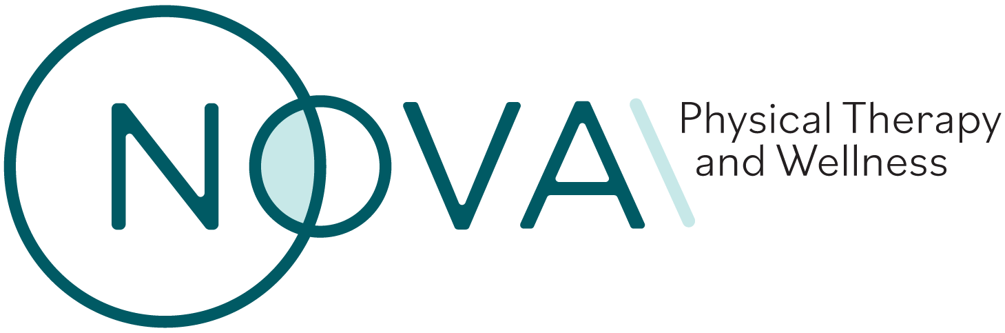
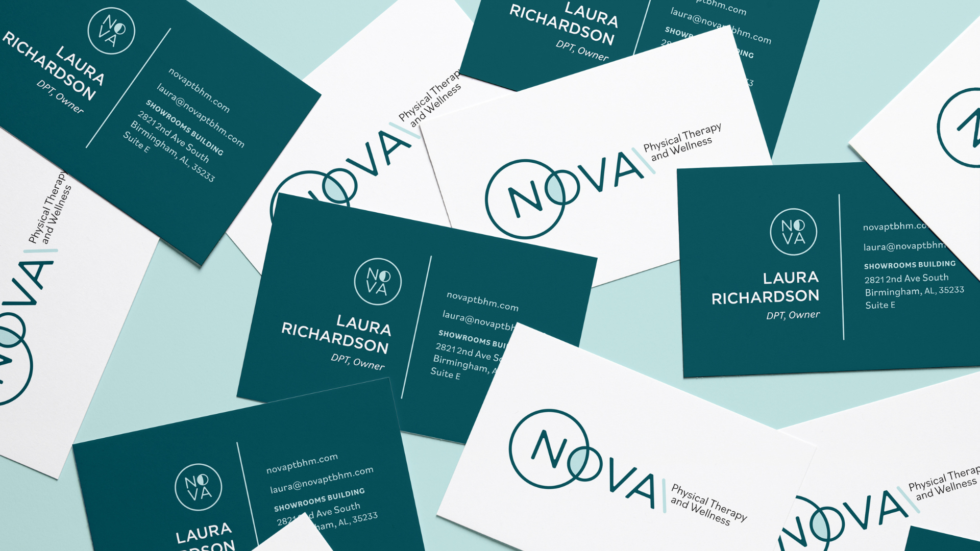
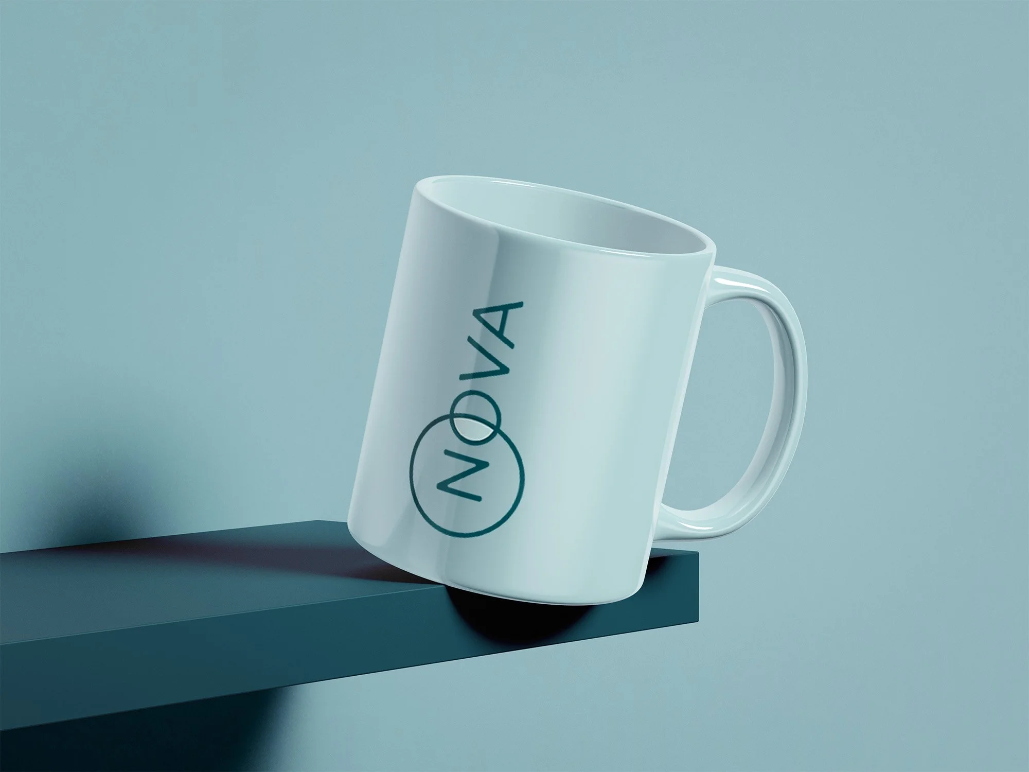
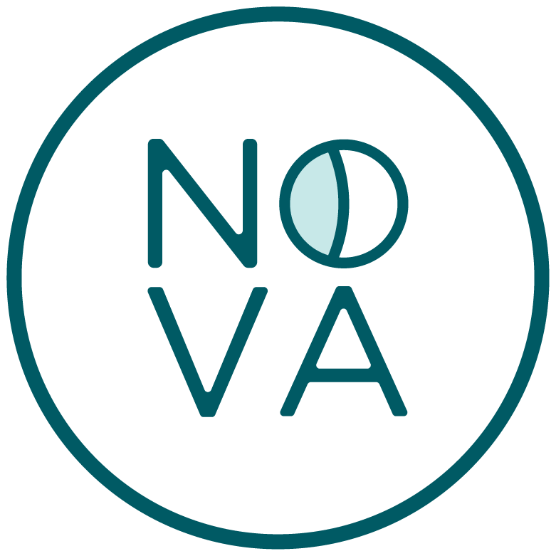
The visual identity centers around the circle—a symbol of wholeness, continuity, and inclusivity. Inspired by the client's emphasis on holistic healing and personalized care, I developed a cohesive brand system that communicates warmth, trust, and movement while reflecting the welcoming experience patients can expect throughout their recovery journey.


• DEEP TEAL
PRIMARY
• AQUA
PRIMARY
• RENEWAL
PRIMARY
• CHARCOAL
PRIMARY